10 Best Software to Write Up Data Analysis Reports

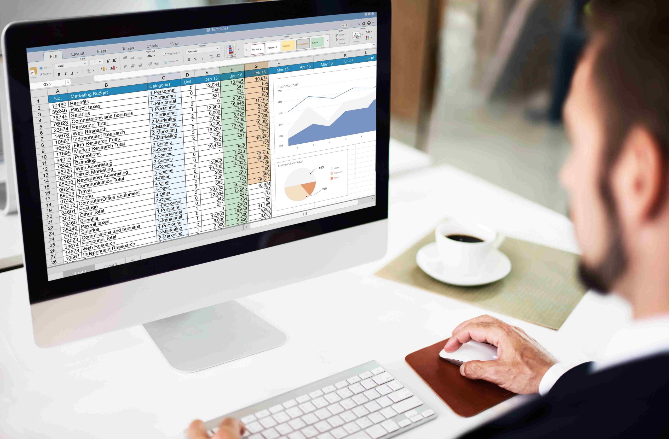
Running the analysis is only half the job. The other half is putting the results in front of someone who was not in the room while you crunched the numbers, and doing it in a way that survives their first skim without a follow-up meeting to explain what they are looking at. The tool you write that report in matters more than most analysts give it credit for, because a clunky reporting workflow can quietly eat hours you meant to spend on the actual analysis.
This guide covers ten tools people actually use to turn raw data into a finished report, from free options built into tools you already have, to dedicated business intelligence platforms, to programming environments built for analysts who want full control over the output. Each one fits a different kind of team and a different kind of report, so the goal here is matching the tool to the job rather than crowning a single winner.
Before comparing individual tools, it helps to separate two things people often lump together: the analysis itself and the reporting layer on top of it. Some tools in this list, SPSS, JMP, and R among them, do both, they run the statistical tests and produce the document. Others, like Word, Google Docs, and to a large extent Tableau and Power BI, assume the number-crunching already happened somewhere else and focus entirely on presentation. Knowing which category you actually need saves a lot of wasted evaluation time, since comparing a pure reporting tool against a full analysis platform on the same checklist rarely produces a useful answer.
Cost is the other variable worth sorting out early. Free and open-source options, RStudio chief among them, can match or exceed what paid platforms offer for teams with the technical skill to use them, while paid tools buy back the time that a steep learning curve would otherwise cost. Neither path is objectively better; it depends entirely on what your team already knows and how much time you have to spend learning something new before the first report is due.
What to Look for in Data Analysis Reporting Software
A handful of questions narrow the field faster than a feature checklist ever will.
How much of the analysis needs to happen inside the same tool versus being imported from elsewhere? Some tools, like SPSS or JMP, are built to run the statistical analysis and generate the report in one environment. Others, like Google Docs or Microsoft Word, assume you already ran the numbers somewhere else and just need a clean place to write about them.
Who reads the finished report, and how often does it need to update? A one-time report for a board meeting has different needs than a dashboard that updates daily and gets checked by five people every morning. Static documents suit the former; connected dashboards suit the latter.
And how technical is the team? A tool built around a scripting language rewards people who already write code and frustrates everyone else. A drag-and-drop interface flattens that learning curve but usually trades away some depth in exchange.
1. Microsoft Word With Data Analysis Add-ins
Word is the tool most people already know, and that familiarity alone makes it a reasonable choice for a report that needs to look professional without a learning curve. On its own, Word handles tables, embedded charts, and page formatting well. Pair it with Excel’s Analysis ToolPak for the statistical calculations, then paste or link the results into the document, and you have a workable pipeline for reports that do not require heavy statistical modeling.
Best for: straightforward reports where the audience wants a familiar, printable document rather than an interactive dashboard.
Drawback: Word was not built for data. Anything beyond basic charts and tables means bolting on Excel or a separate statistics package, and large datasets or complex visualizations quickly outgrow what the format handles gracefully.
2. Google Docs With Google Sheets Integration
Google Docs solves the collaboration problem that Word struggles with. Multiple people can edit the same report simultaneously, comment inline, and see changes appear in real time, which matters when a report needs sign-off from more than one stakeholder before it goes out. Linking a Google Sheets range directly into a Docs report means the numbers update automatically when the underlying sheet changes, instead of requiring a manual copy-paste every time the data refreshes.
Best for: distributed teams that need to co-write a report and want live data pulled in from a connected spreadsheet.
Drawback: formatting and layout options are more limited than a dedicated word processor, and the charting tools inside Sheets are basic compared to a purpose-built visualization platform.
3. Tableau
Tableau, now owned by Salesforce, remains one of the most recognizable names in data visualization for a reason. Its drag-and-drop interface lets you build interactive dashboards and detailed visual reports without writing a query, and it connects to a wide range of data sources, spreadsheets, SQL databases, and cloud platforms like Google Analytics among them.
Best for: teams that need to present complex data as an interactive, visually engaging report rather than a static document.
Drawback: licensing costs add up for larger teams, and while the basic drag-and-drop workflow is approachable, building genuinely sophisticated dashboards has a real learning curve.
4. Power BI
Power BI is Microsoft’s answer to Tableau, and its biggest advantage is how tightly it integrates with tools most business teams already use: Excel, Azure, and the rest of the Microsoft 365 stack. Reports built in Power BI update automatically as connected data sources change, and its dashboards support real-time monitoring alongside static reporting.
Best for: organizations already standardized on Microsoft tools who want reporting that plugs directly into their existing data sources.
Drawback: the learning curve for building anything beyond basic reports is steep, and Power BI can be resource-intensive on large datasets without careful query optimization.
5. Zoho Analytics
Zoho Analytics is a cloud-based reporting and BI platform built for teams that want customization without committing to an enterprise-scale platform. It connects to third-party sources including Google Analytics, SQL databases, and spreadsheet files, and includes built-in AI-assisted analysis for spotting trends and anomalies without manually building every chart from scratch.
Best for: small to mid-sized businesses that want a cloud-based, customizable reporting tool without Tableau or Power BI’s steeper price tag.
Drawback: it lacks some of the advanced statistical modeling features found in dedicated analysis platforms like SPSS or JMP, so complex statistical work still needs a separate tool.
6. SAS Visual Analytics
SAS Visual Analytics targets a different tier of user entirely: large enterprises and professional analysts who need deep statistical modeling alongside their reporting. It combines advanced data analysis capabilities with customizable dashboards and strong integration into the broader SAS ecosystem, which matters if your organization already runs other SAS tools.
Best for: enterprise teams that need heavyweight statistical analysis built directly into their reporting pipeline.
Drawback: pricing is enterprise-scale, and the platform is overkill for a small team that just needs to write up a quarterly summary.
7. Qlik Sense
Qlik Sense is a self-service BI tool built around the idea that non-technical users should be able to build their own reports and dashboards without waiting on an analyst. Its drag-and-drop interface and associative data engine let users click through relationships in the data interactively rather than working from a fixed report structure someone else designed.
Best for: organizations that want to put report-building directly in the hands of non-technical staff.
Drawback: the interface can overwhelm new users initially, and it does not match dedicated statistics platforms for advanced modeling work.
8. JMP
JMP, developed as a subsidiary of SAS Institute, is built specifically for statisticians and researchers who need deep analytical capability paired with strong visualization. It handles large datasets and complex statistical models well, and its interactive interface lets you look at data visually while running the underlying statistical tests.
Best for: academic researchers and analysts who need rigorous statistical analysis with visualization built into the same workflow.
Drawback: licensing costs are steep for smaller organizations, and getting real value out of JMP assumes a working knowledge of statistical methods.
9. RStudio (Posit)
RStudio is the integrated development environment analysts use to work with the R programming language, and it remains free and open source. The company behind it renamed itself to Posit in 2022 to reflect its expansion into Python and other data science tools, but the RStudio IDE itself kept its name. For report generation specifically, R Markdown and Quarto let you combine analysis code, narrative text, and generated charts into a single reproducible document that regenerates automatically whenever the underlying data changes.
Best for: analysts comfortable with code who want fully reproducible, version-controllable reports rather than a manually assembled document.
Drawback: it requires real programming knowledge in R, which puts it out of reach for teams without a technical analyst on staff.
10. IBM SPSS Statistics
SPSS, now published as IBM SPSS Statistics, has been a mainstay in academic and social science research for decades. It handles the full analysis pipeline, from statistical tests to report-ready output tables, and its interface is more approachable for non-programmers than R or Python-based alternatives while still supporting fairly advanced statistical procedures.
Best for: researchers and analysts who need dependable, well-tested statistical tooling with a graphical interface rather than a scripting language.
Drawback: licensing is subscription-based and expensive for smaller teams, and it is built more for statistical analysis than for polished, presentation-ready reporting on its own.
Comparison at a Glance
| Tool | Best For | Free Tier | Learning Curve |
|---|---|---|---|
| Microsoft Word + Add-ins | Simple, familiar report documents | No (Microsoft 365 subscription) | Low |
| Google Docs + Sheets | Real-time collaborative reports | Yes, with a Google account | Low |
| Tableau | Interactive visual dashboards | Trial only | Medium to high |
| Power BI | Microsoft-integrated reporting | Limited free tier | Medium to high |
| Zoho Analytics | Customizable cloud BI on a budget | Free trial | Medium |
| SAS Visual Analytics | Enterprise statistical reporting | No | High |
| Qlik Sense | Self-service dashboards for non-technical users | Limited free tier | Medium |
| JMP | Academic and research statistical analysis | Trial only | High |
| RStudio (Posit) | Reproducible, code-based reports | Yes, open source | High |
| IBM SPSS Statistics | Graphical-interface statistical research | Trial only | Medium to high |
Matching the Tool to the Kind of Report You Write
Most of the friction in choosing a reporting tool comes from treating “data analysis report” as one category when it is really several different jobs wearing the same name.
The One-Time Executive Summary
A report that goes to leadership once, gets discussed in a single meeting, and then sits in an archive folder does not need live data connections or an interactive dashboard. Word or Google Docs, with charts pasted or linked in from wherever the analysis actually happened, produces a clean, printable document faster than standing up a BI platform for a single use. The extra setup time a tool like Tableau or Power BI demands only pays off when the report gets reused or updated repeatedly.
The Recurring Operational Dashboard
A report that a team checks every Monday morning is a different animal entirely. Rebuilding a static document weekly wastes time and invites copy-paste errors. This is where connected tools like Power BI, Tableau, or Zoho Analytics earn their subscription cost: point them at the live data source once, and the numbers refresh themselves every time someone opens the dashboard.
The Academic or Scientific Paper
Research writing has different requirements again: statistical rigor, reproducibility, and often a specific citation or formatting standard the journal expects. SPSS and JMP both handle the statistical side well within a graphical interface, while R with Quarto or R Markdown goes a step further by generating the entire document, tables, charts, and narrative text together, directly from the analysis code. That reproducibility matters enormously in research contexts, where a reviewer or a future version of yourself needs to be able to rerun the exact analysis and get the same numbers.
The Cross-Functional Business Report
When a report needs sign-off from finance, marketing, and product before it goes anywhere, real-time collaboration usually matters more than raw analytical horsepower. Google Docs and Sheets, or Power BI if your organization already runs on Microsoft 365, let multiple stakeholders comment, edit, and review the same document without a chain of emailed attachments and version-numbered file names.
A Note on Tool Fatigue
It is tempting to standardize on a single reporting tool across an entire organization, and for some teams that works fine. But forcing every kind of report through one platform often means fighting the tool as much as using it: a marketing team stuck writing statistical research summaries in Word, or a research team trying to build weekly operational dashboards in SPSS, both end up spending more time working around the tool’s limitations than doing the actual analysis. It is usually more efficient to let two or three tools coexist, one for polished documents, one for live dashboards, and one for heavy statistical work, than to force a single platform to do a job it was never built for.
How to Actually Choose
Start by being honest about what the report needs to do after you finish it. A document that gets read once and archived does not need a live dashboard behind it, Word or Google Docs will do the job faster than standing up Tableau for a one-time deliverable. A report that stakeholders check weekly, on the other hand, is exactly what connected BI tools like Power BI or Zoho Analytics are built for, since the numbers update themselves instead of requiring you to rebuild the document every time.
If the analysis itself is the hard part, heavy statistical modeling, hypothesis testing, regression work, lean toward SPSS, JMP, or R rather than trying to force that work through a general-purpose BI tool that was not designed for it. And if your team already lives inside Microsoft or Google’s ecosystem, the integrated option, Power BI or Google Sheets and Docs, usually beats introducing a completely separate platform just for reporting.
None of these tools solve the actual hard part of reporting, which is knowing what the data means and explaining it clearly. They just remove the friction between having that understanding and getting it in front of the person who needs to act on it. Pick the one that gets out of your way fastest for the kind of report you write most often, and do not be afraid to use a second tool for the reports that do not fit the first one’s strengths.
FAQ
What is the easiest data analysis reporting tool for beginners?
Google Docs paired with Google Sheets has the lowest barrier to entry, since most people already know how to use both and the integration between them is straightforward. For teams that want visual dashboards without coding, Qlik Sense and Zoho Analytics are also built with non-technical users in mind.
Which tool is best for reproducible, automated reports?
RStudio with R Markdown or Quarto is the strongest option if your team can write R code, since the report regenerates automatically from the same script every time the underlying data changes. Power BI and Tableau both offer a lighter version of this through connected live data sources, without requiring code.
Do I need a paid tool, or will free options work?
For most straightforward reporting, Google Docs and Sheets, or RStudio if your team can code, cover the job at no cost. Paid tools earn their price once you need advanced statistical modeling, enterprise-scale data volumes, or polished interactive dashboards that a document or spreadsheet cannot deliver.
Can I switch tools partway through a project without redoing the analysis?
Usually yes, as long as the underlying data lives somewhere portable, a CSV export, a shared spreadsheet, or a database, rather than locked inside one tool’s proprietary format. Moving a finished analysis from R into a Word or Google Docs write-up is straightforward since you are just exporting charts and tables. Moving a report between BI platforms like Tableau and Power BI is more painful, since dashboards and calculated fields generally have to be rebuilt from scratch rather than imported directly. If you expect to switch tools later, keep raw data exports on hand in a plain format so you are not starting the analysis over from zero.
What format should the final report be delivered in?
PDF remains the safest default for anything that needs to look identical on every device and every printer, since it locks in layout in a way an editable document or a live dashboard link cannot. Most of the tools above export directly to PDF once the report is finished. If your workflow also involves marking up or annotating those exported PDFs before final delivery, our roundup of the best PDF markup software covers the tools built specifically for that step.
If you are running an Easy Digital Downloads store and want to turn this same reporting discipline toward your own sales data instead of a client’s, our guide to EDD analytics and reporting walks through building the same kind of recurring dashboard for store performance specifically.